This concept began as an academic exploration by a young designer on our team. We found
the thinking behind it interesting enough to revisit it as a design case study: what happens when you design not around what technology can do, but around the moments when technology fails the user?
Most of us don’t think twice before reaching for our phones when we need to translate something. Type a sentence, speak into the microphone or point the camera at some text, and within seconds we have an answer.
For most everyday situations, that works remarkably well. But design becomes interesting when you start looking at the situations where the obvious solution doesn’t work quite so well.
Imagine arriving in an unfamiliar country with poor connectivity and a dying phone battery. Or trying to communicate in a noisy transit hub. Think of an elderly traveler struggling to navigate an unfamiliar touchscreen interface, or a conversation in a healthcare setting where privacy, attention and clarity matter.
The technology for translation already exists. The question this project explored was different: is the smartphone always the right interface through which to access it?
That question led to the Compact Translator, a conceptual pocket-sized translation device designed around offline use, tactile controls and a simple interaction between two people. What interested us about revisiting this project wasn’t necessarily the product itself. It was the process behind it. Because before deciding what the object should look like, the project first tried to understand where the existing experience was creating friction. And that is where good design usually begins.
Start with the friction, not the form
One of the easiest mistakes in design is to start thinking about the solution too early. If the brief is “design a translator”, it is tempting to immediately think about the shape of the device, the screen, the colors, the buttons and the materials. But change the question to “What makes translation difficult in certain situations?” and a different set of considerations appears.
The original project examined situations such as international transit, healthcare environments and migration or border-processing contexts. Across them, several possible points of friction emerged: connectivity may be unreliable, environments can be noisy, users may already be under stress, and operating a phone requires a surprising number of small actions.
You unlock it. Find the app. Select a language. Position the microphone. Hand the phone over or turn the screen around. Then repeat. None of these actions is particularly difficult in isolation. But good user experience design isn’t only about whether someone can perform an action. It is also about how much attention that action demands at the moment they need to perform it.
There was another, more human observation behind the concept. Translation is usually an interaction between two people, while a smartphone is fundamentally a personal device designed around one primary user. That creates an interesting design contradiction. Instead of helping two people communicate, the device can sometimes become the centre of the communication itself. So the problem gradually became less about designing a translator and more about asking:
How could the interface get out of the way of the conversation?
Turning observations into a design system
Once the problem had been reframed, the physical design started to make more sense.
Rather than beginning with aesthetics, the project established a simple set of principles. The proposed device would work without continuous internet connectivity. Frequently used actions would not be buried inside menus. Two people should be able to follow the interaction without constantly passing the device backwards and forwards. And the interface needed to remain relatively simple even when the user was distracted or under stress.
Those principles became the beginnings of a design system.
We often associate the term “design system” with digital products a library of components, colors, typography and interaction rules. But at its heart, a design system is really a set of decisions that creates consistency.
In a physical product, those decisions can determine where controls sit, which actions deserve dedicated buttons, how information is prioritized, how surfaces feel and how the user intuitively understands the hierarchy of the object.
Once those rules are clear, design becomes less arbitrary. You are no longer asking, “Where would this button look good?” You are asking, “How important is this action, and therefore how accessible should it be?” That is a very different way of designing.
Why go back to physical buttons?
The smartphone has trained us to think that almost every interaction belongs on a touchscreen. And for good reason. One piece of glass can become hundreds of different interfaces. But that versatility comes with a trade-off: functions have to be found.
The Compact Translator concept looked towards an earlier generation of handheld electronics, pocket translators, personal organisers and handheld gaming devices as references. Not because retro technology is inherently better, but because these products were designed before almost every function migrated behind a touchscreen.
Their interfaces had to communicate priority physically.
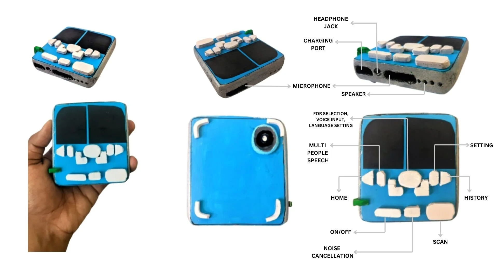
That thinking led to dedicated controls for the functions imagined as most important to the translation experience. The concept proposed direct access to scanning, language switching, multi-speaker conversation and noise management, while less frequently used functions such as settings and history could occupy a secondary level.
The design principle behind this was straightforward:
Frequency should determine accessibility.
If a user needs something repeatedly, the interface shouldn’t make them search for it repeatedly. Physical controls could also potentially make the device easier to operate with gloves, with limited dexterity or without constantly looking down at the screen. Here, tactile design wasn’t being proposed as an alternative to technology. It was being used as a way of making technology easier to reach.
Designing an interface for a conversation
Perhaps the most interesting part of the concept is the proposed split-screen display. A conventional phone screen assumes that one person is looking at it. Translation challenges that assumption because there are at least two participants.
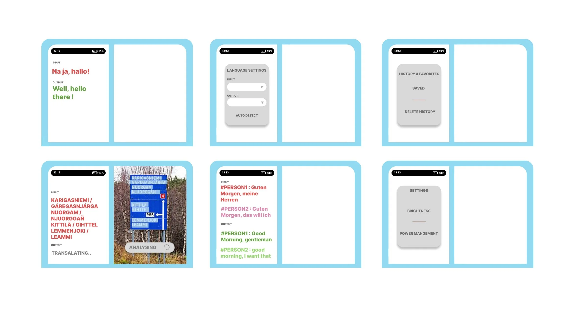
The concept therefore explored dividing the display between the original input and translated output so that the conversation could be easier for both participants to follow. Whether this exact interaction would ultimately survive user testing is a question for a later prototype. But the thinking behind it is valuable because it demonstrates something that can easily get lost when designing interfaces.
Interface design isn’t simply about arranging information. It is about shaping behaviour.
If an interface makes people repeatedly pass a device backwards and forwards, that physical behaviour is part of the user experience. If another layout allows the device to sit between two people while they continue to engage with each other, that too becomes part of the experience. Suddenly, the screen isn’t simply a rectangle that needs information placed inside it. It becomes part of the relationship between the people using the product.
Form follows behaviour
Only after these interaction principles had begun to emerge did the project move more deeply into form.
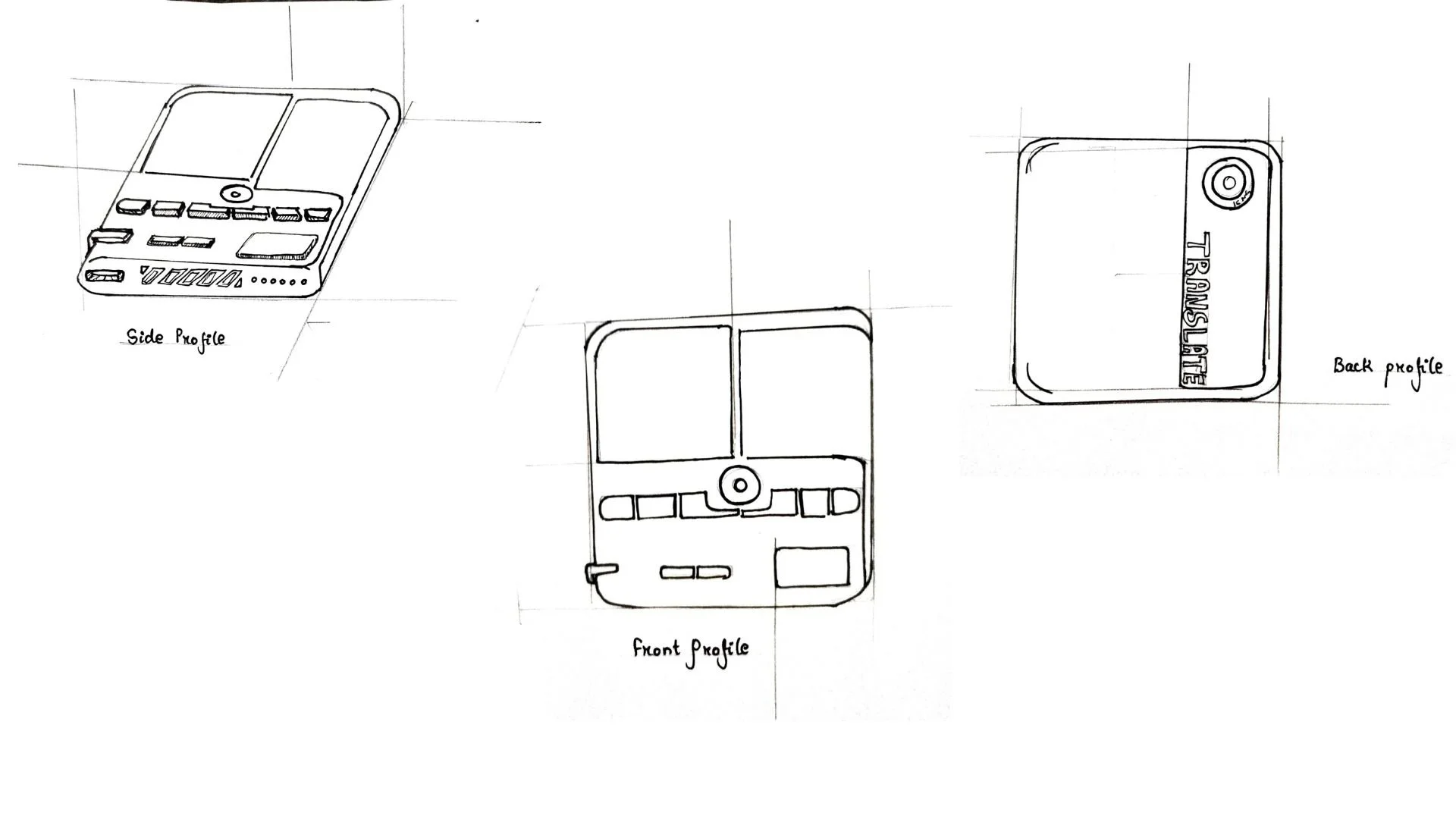
Sketches explored a rectangular handheld device, slightly wider than a deck of cards. The screen occupied the upper section, while the physical controls were positioned below within easy reach. The design also created a functional hierarchy across the object. Primary interactions occupied the front. Utility functions and ports were moved to the sides. The proposed camera for scanning printed material sat at the back.
Material thinking followed the same logic. Softer grip surfaces were considered for stability, a matte front surface for reduced glare, and harder button materials for clearer tactile feedback. The visual palette was deliberately restrained because a functional device intended to reduce cognitive load should not introduce unnecessary visual noise.
None of these decisions is dramatic on its own. That is almost the point. Good design often consists of many small decisions that all answer the same larger question.
Then the sketch had to become something you could hold
There is only so much a drawing can tell you about a physical object. Something can look beautifully proportioned on paper and feel completely wrong the moment it reaches your hand.
The academic project therefore moved from sketches into a one-to-one foam prototype. High-density polyurethane foam was used to explore the volume, proportions, grip and placement of controls.
This is where assumptions began to change. The first iteration suggested that the device was slightly too long for smaller hands while being too narrow to provide a stable grip for larger hands. The next version shortened the body and increased its width. Recesses were then introduced to explore button placement and thumb reach, and the side profile wasrefined to improve the gripping surface and make the object feel visually thinner.
This part of the process is important because it demonstrates why prototyping exists. A prototype is not simply a rough version of the final product.
It is a question made physical.
In this case, the question wasn’t yet whether the AI translation worked. It was whether the proposed form made sense in a human hand. A few millimeters suddenly mattered. Button placement mattered. Width mattered. Grip mattered. Things that appeared resolved in a sketch became questions again once they existed in three dimensions.
That is exactly what a useful prototype should do.
Being clear about what was and wasn’t designed
This distinction is particularly important with conceptual design projects. The Compact Translator is not a functioning translation product. The foam prototype explored the physical design: form, proportions, ergonomics and proposed control placement. Features such as offline AI translation, optical character recognition, speaker identification and adaptive noise cancellation remained part of the conceptual product specification and were not technically implemented or validated in the prototype.
That doesn’t make the prototype unsuccessful. It simply tells us what stage of the design process it represents. Different prototypes answer different questions. A foam model can test ergonomics. A visual prototype can test aesthetic language. An interactive digital prototype can test navigation. An engineering prototype can test technical feasibility.
The important question isn’t, “Does this prototype work?”
It is:
“What were we trying to learn by making it?”
Here, the learning was primarily about whether a dedicated translation device could create a simpler physical relationship between the user and the technology. Technical feasibility would be another design and engineering journey altogether.
Technology doesn’t always need to look technological
There is a larger thought behind this project that we find particularly relevant today. Technology is becoming extraordinarily sophisticated. AI can increasingly understand speech, translate languages, identify speakers and interpret images.
But greater technological capability doesn’t automatically require a more complicated interface. Sometimes the opposite should happen. As the technology becomes more sophisticated, perhaps the user should have to think about it less.
A person doesn’t need to understand edge processing. They simply need their translation to work without connectivity. They don’t need to understand audio processing. They need to be heard in a noisy environment. They don’t need to know what is happening behind ten different menu options. They need the right action to be obvious at the moment they need it.
This is where design becomes the bridge between technological capability and human behavior. And sometimes the most sophisticated design decision is to hide the sophistication.
What this small academic project reminded us about design
At Qrious, much of our design work lives in different worlds, brand identities, communication systems, digital experiences, campaigns and visual storytelling. A conceptual physical product might seem quite removed from those disciplines.
But the thinking underneath is remarkably similar. Good design begins with observation. You look for friction before looking for aesthetics. You ask whether the obvious problem is actually the real problem. You establish a hierarchy. You create rules. You remove what isn’t necessary. You prototype an idea. And then, importantly, you allow what you learn to change the design.
That is why this academic exploration by a young designer on our team caught our attention.
Not because we believe the world necessarily needs another translation device. And not because this foam prototype proves that this particular product should exist. It interested us because it questions an assumption that has become so normal that we rarely notice it anymore: if technology can perform a function on a smartphone, does that automatically mean the smartphone is the best-designed way to perform that function?
Sometimes the answer will unquestionably be yes. Sometimes it may be no. But asking the question is where design begins. Because ultimately, design is not about making something look like it has been designed.
It is about understanding the problem deeply enough to know what deserves to be designed in the first place.